LoQui
Overview
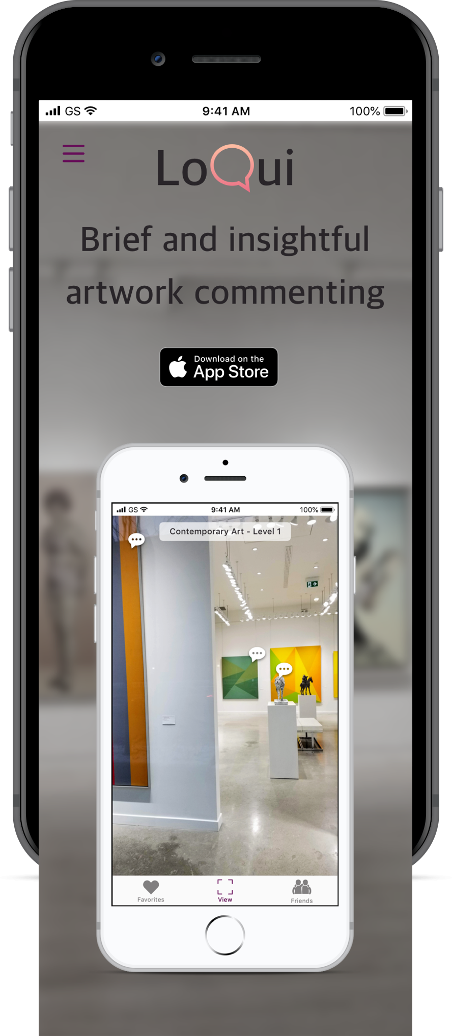
LoQui enhances your art gallery viewing experience with an Augmented Reality overlay that taps into the knowledge of other visitors. It collects recommendations and thought-provoking comments to create informative and inspirational discussions that will stick with you long after you leave.
Project Duration: 10 Weeks

Problem Space
On a typical day at a public art gallery, visitors can be seen being led on guided tours, downloading and listening to audio guides, and scanning brochures and artwork labels for information. They can also be seen having conversations - how does the artwork make them feel? What techniques did the artist use? What influenced the artists creations? The reason that visitors attend galleries is to expand their knowledge and perspectives, explore and reflect on new ideas, and to be inspired.
Unfortunately, information is not always presented in a way that motivates and energizes visitors. Tours can fill-up and drag-on; audio guides can be lengthy and hinder your ability to talk to your companion; brochures and written descriptions can be arduous and curated to a specific point of view. Overall, although visitors enjoy the gallery they often hit a point where they feel overwhelmed and tired. Visitors enjoy conversation because it allows them to get a different perspective. They learn more and are energized through participation, and their movement around the gallery is more flexible. Conversation however, is often limited to the other person that they are visiting the gallery with. Oftentimes visitors go to the gallery alone.
How might we energize and inspire art gallery visitors by facilitating conversation between them?
Secondary Research
In order to understand the space more, apps that provide information to art gallery visitors were examined. Here’s a quick summary of notable apps that I looked at:
MoMAR gallery app: created by a number of artists who turned the MOMA into their own augmented reality show. Paintings are used as points of reference for Guerilla artworks.
Cuseum: using AR, virtually restored stolen works to their frames but it was not without controversy. As mobile devices expand physical space into AR , it poses the questions of who own virtual space?
Google Arts and Culture: includes an ‘Art Recognizer’ where you can point your device at artworks to learn more about them (only at select museums).
Instagram: visitors post photos of themselves at shows, they immerse themselves in the experience and share their thoughts. Galleries use Instagram to promote shows and provide information to visitors.
User Research
Next, I wanted to find out more about visitors pain points & challenges, behaviours, and motivations at the art gallery. Five interviewees were selected who attend public art galleries more than once a year and are familiar with social media.
Interview questions were crafted to be non-leading and conversational. The majority of interviews took place in person in order to observe what the interviewee as doing, saying, feeling, and thinking. Two were done via video-call.
From these interviews, the following key insights were uncovered.

Key Insights
Visitors are overloaded with information at art
galleries.Visitors prefer conversation over audio guides and
written information beside the artwork.Visitors have trouble determining what to see in
limited amounts of timeThe way that shows are presented can add or
subtract valueGallery visits challenge visitors viewpoints and
broadens their perspective
Quotes
“I talked to my co-worker about how you could pick things out in the garbage pile that you had thrown out. You put things out of your mind. It was eye-opening and hard to swallow, we felt like we were consuming a lot. ”
— LAUREN D.
"I wish the audio guide was more condensed, there was too much information. I learned a lot but they need to consider a person's attention span."
— MARTHA C.
"I read about the painting in the write-up beside it, but you couldn’t read them all. There was so much detail in each painting and the write-ups were essays"
— MARNIE W.
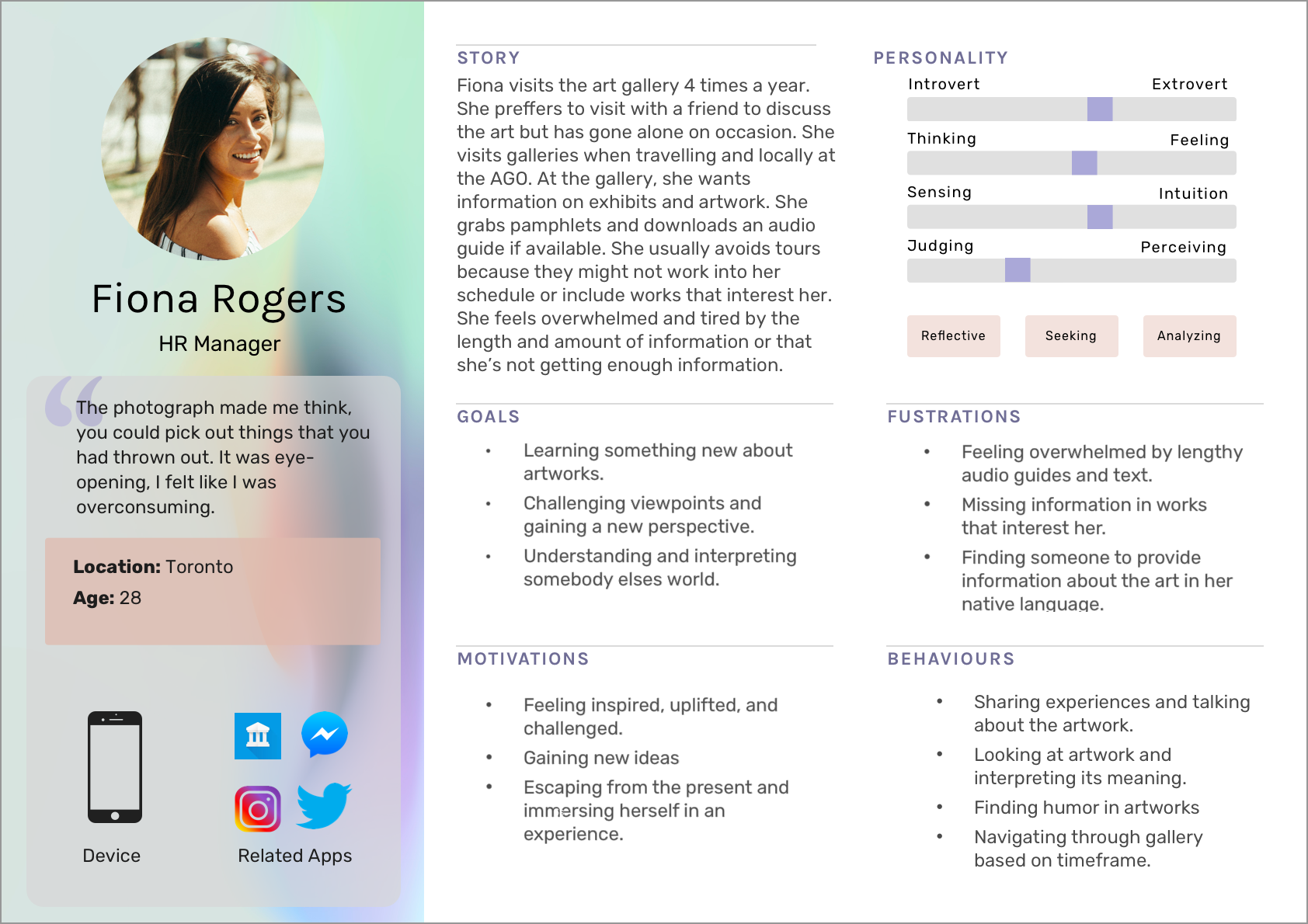
The results of the User Research helped craft a Primary Persona based on the average experience of the Interviewees:
A Journey Map was created to illustrate the highs and lows of
Fiona’s journey:

The experience map offered further insights into Fiona’s experience getting information on artworks at the public art gallery.
Low Point
Mid way through her visit, Fiona feels frustrated with the way that she is receiving information. She has a friend with her however, and draws energy and excitement from their conversation. Near the end of the exhibit Fiona’s energy level dips back down and she feels overwhelmed and exhausted.
High point
Fiona is excited to go to the gallery, she loves getting new perspectives and being immersed in an experience. Overall, she is excited to share her experience with her friends and family after her visit.
Opportunity
Fiona loves going to the gallery but her experience could be greatly enhanced by providing information on artworks in a more energizing way. Why not let visitors pool their knowledge in a conversational manner that encourages them to participate and get different perspectives? Prioritise where to go and what to see based on artworks that attract the most conversation. Allow visitors the opportunity to connect. Make the experience interactive and engaging. Give visitors like Fiona the right amount of information, make it brief and informative.
Task Selection

Main Task
Retrieving and leaving comments on artworks in public art galleries.

Sub Tasks
Favouriting so that you can share and talk about the artwork after your visits.
Adding a friend, when you have a friend you favourites come up what that friends visits the same gallery space (not outside of it!).

Wireframes
Wireframes helped map out the key UX and interaction components, hierarchy of information, and screen flows to determine the structure of the app.

Key components mapped-out:
AR Overlay
Search for and view comments that other visitors have left on artworks.
Select and leave comments on any artwork.
Comment View
Scroll through brief and informative comments left by other visitors.
Upvote comments through favouriting.
Participate by composing and leaving a comment of your own.
Participate by composing and leaving a comment of your own.
Friend Favourites
See if your friends have visited the gallery and what artworks they have favourited.
Your Favourites
Save your favourites so that you can share them with friends and family after you visit.
User-Testing & Iterations
Once the wireframes were digitised in Sketch, a Prototype was created in InVision and given to Users to test. Through these tests, user insights, validations, and feedback were collected. This information was used to iterate and improve the apps usability.
Viewing and Leaving Comments Flow - 1st Iteration

Viewing and Leaving Comments Flow - 2nd Iteration

Viewing and Leaving Comments Flow - 3rd Iteration

UI Design

Colour Pallet
After a number of iterations, the UI of LoQui was focused on. There were many options for the colour pallet relating to the mood and feel of the app. Ultimately, the pallet to the left was selected as it fits the aesthetic of gallery space. Visitors will be at the gallery during the day and a white background with dark text will contribute to readability. Warm salmon and rose colours invite conversation and deeper purple provides an energizing edge

Wordmark Evolution
Font: Apple SD Gothic Neo, Bold
Friendly and approachable with an edge.
Coloured lips portray the conversational element of the app. A subtle gradient portrays the movement and flux of conversation. The comment bubble further adds to the conversational element.
Responsive Marketing Website
A responsive marketing website was developed as a tool to help visitors evaluate LoQui before trying it out. The website was design to mimic the app’s theme of uncovering information in an exploratory and energizing way.


High-Fidelity Prototype
UI elements were infused in the Prototype which continued to undergo testing. Designs were further iterated based on feedback.
Check out the final Prototype in InVision!


Future Considerations
Trolling artworks and artists:
During the design process, consideration was given to the opportunity for visitors to take advantage of the commenting feature and troll artworks. The upvoting feature and comment clearing on a weekly basis were included as a way to mitigate this but it may not be enough. Flagging could be incorporated to mark inappropriate comments.
Opposing views of the gallery, artist, and curator:
Getting galleries, artists, and curators to accept and work with the app is an important consideration. The app could host curator or artist takeovers (similar to Instagram) to encourage involvement and understanding of how the app works. Curators could use the app to see what artworks are the most popular and gain insight on visitor habits.
Connecting Visitors
Based on feedback, visitors really enjoyed getting the opportunity to keep the conversation going and connect with other visitors in real life. These opportunities could be further explored by introducing indicators when someone is actively commenting. Bonus comments written by the curator could be uncovered when you pair up with another visitor.
Credits
Icons: The Noun Project (contain specific credits).
Photos of people in art galleries: Unsplash (contain specific credits).